Bootstrap Forms
In this tutorial you will learn how to create elegant form layouts with Bootstrap.
Creating Forms with Bootstrap
HTML forms are an integral part of the web pages and applications, but creating the form layouts or styling the form controls manually one by one using CSS are often boring and tedious. Bootstrap greatly simplifies the process of styling and alignment of form controls like labels, input fields, selectboxes, textareas, buttons, etc. through predefined set of classes.
Bootstrap provides three different types of form layouts:
- Vertical Form (default form layout)
- Horizontal Form
- Inline Form
The following section will give you the detailed overview of all these form layouts as well as the various form related Bootstrap components one by one. Well let's get started.
Creating Vertical Form Layout
To create vertical form layouts simply use the predefined margin utility classes for grouping the labels, form controls, optional form text, and form validation messages.
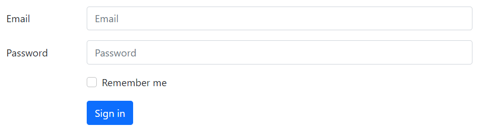
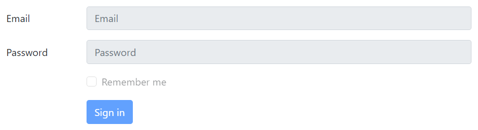
Here's an example in which form controls are vertically stacked with labels on the top.
Example
Try this code »<form>
<div class="mb-3">
<label class="form-label" for="inputEmail">Email</label>
<input type="email" class="form-control" id="inputEmail" placeholder="disabled">
</div>
<div class="mb-3">
<label class="form-label" for="inputPassword">Password</label>
<input type="password" class="form-control" id="inputPassword" placeholder="disabled">
</div>
<div class="mb-3">
<div class="form-check">
<input class="form-check-input" type="checkbox" id="checkRemember">
<label class="form-check-label" for="checkRemember">Remember me</label>
</div>
</div>
<button type="submit" class="btn btn-primary">Sign in</button>
</form>— The output of the above example will look something like this:

You will learn about custom checkboxes and other custom form controls in the next chapter.
Note: All textual form controls, such as <input> and <textarea> requires the class .form-control, while <select> requires the class .form-select for general styling. These classes also makes the forms controls 100% wide. To change their width or use them inline, you can utilize the Bootstrap's predefined grid classes.
Tip: It is recommend to use margin-bottom utility classes (e.g., mb-2, mb-3, etc.) to add vertical spacing between the form groups. As, using single direction margin throughout in the form prevent margin collapsing and create more consist form.
Creating Horizontal Form Layout
You can also create horizontal form layouts where labels and form controls are aligned side-by-side using the Bootstrap grid classes. To create a horizontal form layout add the class .row on form groups and use the .col-*-* grid classes to specify the width of your labels and controls.
Also, be sure to apply the class .col-form-label on the <label> elements, so that they're vertically centered with their associated form controls. Let's check out an example:
Example
Try this code »<form>
<div class="row mb-3">
<label for="inputEmail" class="col-sm-2 col-form-label">Email</label>
<div class="col-sm-10">
<input type="email" class="form-control" id="inputEmail" placeholder="disabled">
</div>
</div>
<div class="row mb-3">
<label for="inputPassword" class="col-sm-2 col-form-label">Password</label>
<div class="col-sm-10">
<input type="password" class="form-control" id="inputPassword" placeholder="disabled">
</div>
</div>
<div class="row mb-3">
<div class="col-sm-10 offset-sm-2">
<div class="form-check">
<input class="form-check-input" type="checkbox" id="checkRemember">
<label class="form-check-label" for="checkRemember">Remember me</label>
</div>
</div>
</div>
<div class="row">
<div class="col-sm-10 offset-sm-2">
<button type="submit" class="btn btn-primary">Sign in</button>
</div>
</div>
</form>— The output of the above example will look something like this:
Creating Inline Form Layout
Sometimes you may want to display a series of form controls, and buttons in a single horizontal row to compact the layout. You can do this easily by using the Bootstrap's grid classes.
Let's take a look at following example and see how it actually works:
Example
Try this code »<form>
<div class="row align-items-center g-3">
<div class="col-auto">
<label class="visually-hidden" for="inputEmail">Email</label>
<input type="email" class="form-control" id="inputEmail" placeholder="disabled">
</div>
<div class="col-auto">
<label class="visually-hidden" for="inputPassword">Password</label>
<input type="password" class="form-control" id="inputPassword" placeholder="disabled">
</div>
<div class="col-auto">
<div class="form-check">
<input class="form-check-input" type="checkbox" id="checkRemember">
<label class="form-check-label" for="checkRemember">Remember me</label>
</div>
</div>
<div class="col-auto">
<button type="submit" class="btn btn-primary">Sign in</button>
</div>
</div>
</form>— The output of the above example will look something like this:

Check out the snippets section for examples of some beautifully designed Bootstrap forms.
Tip: It is recommended to include a label for every form inputs otherwise screen readers will have trouble with your forms. However, in case of inline form layouts you can hide the labels using the .visually-hidden class, so that only screen readers can read it.
Creating Responsive Form Layout
You can also make your forms responsive through using the grid classes with specific breakpoints.
The following example will create a form which laid out inline on medium devices and up (i.e., viewport width ≥768px), but will become vertically stacked on smaller viewports.
Example
Try this code »<form>
<div class="row align-items-center g-3">
<div class="col-md-auto col-12">
<label class="form-label d-md-none" for="inputEmail">Email</label>
<input type="email" class="form-control" id="inputEmail" placeholder="disabled">
</div>
<div class="col-md-auto col-12">
<label class="form-label d-md-none" for="inputPassword">Password</label>
<input type="password" class="form-control" id="inputPassword" placeholder="disabled">
</div>
<div class="col-md-auto col-12">
<div class="form-check">
<input class="form-check-input" type="checkbox" id="checkRemember">
<label class="form-check-label" for="checkRemember">Remember me</label>
</div>
</div>
<div class="col-md-auto col-12">
<button type="submit" class="btn btn-primary">Sign in</button>
</div>
</div>
</form>Creating Static Form Control
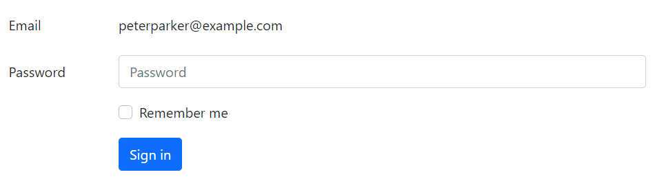
There might be a situation when you just want to display a plain text value next to a form label instead of a working form control. You can do this easily by replacing the class .form-control with the .form-control-plaintext and applying the attribute readonly.
The .form-control-plaintext class removes the default styling from the form field, but preserves the correct margin and padding. Let's take a look at an example:
Example
Try this code »<form>
<div class="row mb-3">
<label for="inputEmail" class="col-sm-2 col-form-label">Email</label>
<div class="col-sm-10">
<input type="email" readonly class="form-control-plaintext" id="inputEmail" value="peterparker@example.com">
</div>
</div>
<div class="row mb-3">
<label for="inputPassword" class="col-sm-2 col-form-label">Password</label>
<div class="col-sm-10">
<input type="password" class="form-control" id="inputPassword" placeholder="disabled">
</div>
</div>
<div class="row mb-3">
<div class="col-sm-10 offset-sm-2">
<div class="form-check">
<input class="form-check-input" type="checkbox" id="checkRemember">
<label class="form-check-label" for="checkRemember">Remember me</label>
</div>
</div>
</div>
<div class="row">
<div class="col-sm-10 offset-sm-2">
<button type="submit" class="btn btn-primary">Sign in</button>
</div>
</div>
</form>— The output of the above example will look something like this:
Column Sizing of Form Controls
You can also match the size of your inputs, textareas and select boxes to the Bootstrap grid column sizes. Simply, place your form controls (i.e. <input>, <textarea>, and <select>) in grid columns.
Let's try out the following example to understand how it basically works:
Example
Try this code »<div class="row g-3">
<div class="col-6">
<input type="text" class="form-control" placeholder="disabled">
</div>
<div class="col-4">
<select class="form-select">
<option>State</option>
</select>
</div>
<div class="col-2">
<input type="text" class="form-control" placeholder="disabled">
</div>
</div>— The output of the above example will look something like this:

Placing Checkboxes and Radio Buttons Inline
By default, any number of custom checkboxes and radio buttons that are immediate sibling will be vertically stacked and appropriately spaced with .form-check class.
But, you can also place these custom checkboxes and radio buttons inline (i.e., in the same line) by simply adding the class .form-check-inline to .form-check element, like this:
Example
Try this code »<div class="row">
<div class="col-12">
<div class="form-check form-check-inline">
<input type="checkbox" class="form-check-input" name="hobbies" id="checkMusic">
<label class="form-check-label" for="checkMusic">Music</label>
</div>
<div class="form-check form-check-inline ms-3">
<input type="checkbox" class="form-check-input" name="hobbies" id="checkTravel" checked>
<label class="form-check-label" for="checkTravel">Travel</label>
</div>
<div class="form-check form-check-inline ms-3">
<input type="checkbox" class="form-check-input" name="hobbies" id="checkReading" checked>
<label class="form-check-label" for="checkReading">Reading</label>
</div>
</div>
</div>— The output of the above example will look something like this:
Similarly, you can place the radio buttons inline, as shown in the following example:
Example
Try this code »<div class="row">
<div class="col-12">
<div class="form-check form-check-inline">
<input type="radio" class="form-check-input" name="gender" id="radioMale" checked>
<label class="form-check-label" for="radioMale">Male</label>
</div>
<div class="form-check form-check-inline ms-3">
<input type="radio" class="form-check-input" name="gender" id="radioFemale">
<label class="form-check-label" for="radioFemale">Female</label>
</div>
</div>
</div>— The output of the above example will look something like this:
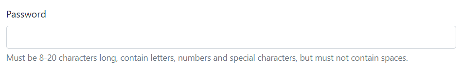
Adding Help Text to Form Controls
Placing help text for the form controls in an efficient way to guide users to enter the correct data in a form. You can place block level help text for a form control using the class .form-text. The block help text is typically displayed at the bottom of the control. Here's an example:
Example
Try this code »<label class="form-label" for="inputPassword">Password</label>
<input type="password" class="form-control" id="inputPassword">
<div class="form-text">
Must be 8-20 characters long, contain letters, numbers and special characters, but must not contain spaces.
</div>— The output of the above example will look something like this:
Similarly, you can also place inline help text using the <small> element. No need to use .form-text in this case. The following example shows how to implement this:
Example
Try this code »<div class="row align-items-center g-3">
<div class="col-auto">
<label class="col-form-label" for="inputPassword">Password</label>
</div>
<div class="col-auto">
<input type="password" class="form-control" id="inputPassword">
</div>
<div class="col-auto">
<span class="form-text">Must be 8-20 characters long.</span>
</div>
</div>— The output of the above example will look something like this:

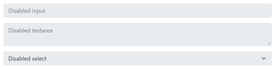
Creating Disabled Form Controls
To disable individual form controls such as <input>, <textarea>, <select> just add the attributes disabled to them and Bootstrap will do the rest. Here's an example:
Example
Try this code »<input type="text" class="form-control mb-3" placeholder="disabled" disabled>
<textarea class="form-control mb-3" placeholder="disabled" disabled></textarea>
<select class="form-select" disabled>
<option>Disabled select</option>
</select>— The output of the above example will look something like this:
However, if you want to disable all controls within a <form> at once, place them inside a <fieldset> element and apply the attribute disabled on it, as shown in the following example:
<form>
    <fieldset disabled>
        <div class="row mb-3">
            <label for="inputEmail" class="col-sm-2 col-form-label">Email</label>
            <div class="col-sm-10">
                <input type="email" class="form-control" id="inputEmail" placeholder="disabled">
            </div>
        </div>
        <div class="row mb-3">
            <label for="inputPassword" class="col-sm-2 col-form-label">Password</label>
            <div class="col-sm-10">
                <input type="password" class="form-control" id="inputPassword" placeholder="disabled">
            </div>
        </div>
        <div class="row mb-3">
            <div class="col-sm-10 offset-sm-2">
                <div class="form-check">
                        <input class="form-check-input" type="checkbox" id="checkRemember">
                        <label class="form-check-label" for="checkRemember">Remember me</label>
                </div>
            </div>
        </div>
        <div class="row">
            <div class="col-sm-10 offset-sm-2">
                <button type="submit" class="btn btn-primary">Sign in</button>
            </div>
        </div>
    </fieldset>
</form>
— The output of the above example will look something like this:
Creating Readonly Inputs
You can also add the readonly boolean attribute on an input or textarea to prevent the modification of its value. Read-only inputs appear in lighter background (just like disabled inputs), but it retain the standard text cursor. Check out the following example to see how it works:
Example
Try this code »<input type="text" class="form-control mb-2" value="This input value cannot be changed." readonly>
<textarea rows="3" class="form-control" readonly>This textarea value cannot be changed.</textarea>— The output of the above example will look something like this:

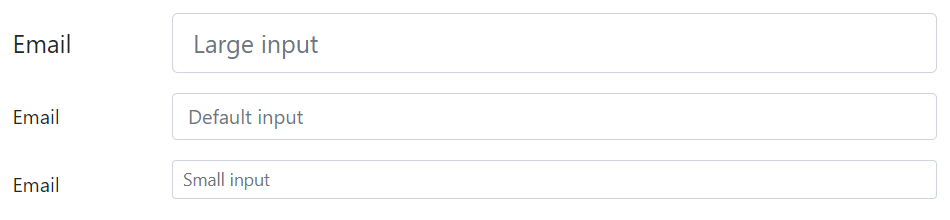
Height Sizing of Form Controls
You can easily change the height of your text inputs and select boxes to match the button sizes.
Use the form control height sizing classes such as .form-control-lg and .form-control-sm on the text inputs to create it's larger or smaller sizes. Here's an example:
<div class="row mb-3">
    <label class="col-sm-2 col-form-label col-form-label-lg">Email</label>
    <div class="col-sm-10">
        <input type="email" class="form-control form-control-lg" placeholder="disabled">
    </div>
</div>
<div class="row mb-3">
    <label class="col-sm-2 col-form-label">Email</label>
    <div class="col-sm-10">
        <input type="email" class="form-control" placeholder="disabled">
    </div>
</div>
<div class="row">
    <label class="col-sm-2 col-form-label">Email</label>
    <div class="col-sm-10">
        <input type="email" class="form-control form-control-sm" placeholder="disabled">
    </div>
</div>
— The output of the above example will look something like this:
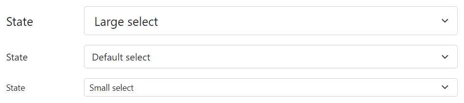
Similarly, you can create larger and smaller variants of the select boxes using the .form-select-lg and .form-select-sm classes on the <select> element, like this:
<div class="row mb-3">
    <label class="col-sm-2 col-form-label col-form-label-lg">State</label>
    <div class="col-sm-10">
        <select class="form-select form-select-lg">
            <option>Large select</option>
        </select>
    </div>
</div>
<div class="row mb-3">
    <label class="col-sm-2 col-form-label">State</label>
    <div class="col-sm-10">
        <select class="form-select">
            <option>Default select</option>
        </select>
    </div>
</div>
<div class="row">
    <label class="col-sm-2 col-form-label col-form-label-sm">State</label>
    <div class="col-sm-10">
        <select class="form-select form-select-sm">
            <option>Small select</option>
        </select>
    </div>
</div>
— The output of the above example will look something like this:
Bootstrap Form Validation
Bootstrap provides an easy and quick way to validate web forms on client-side. It uses browser's native form validation API to validate the form. Form validation styles are applied via CSS :invalid and :valid pseudo-classes. It applies to <input>, <select>, and <textarea> elements.
Let's try out the following example and see how it actually works:
Example
Try this code »<form class="needs-validation" novalidate>
<div class="mb-3">
<label class="form-label" for="inputEmail">Email</label>
<input type="email" class="form-control" id="inputEmail" placeholder="disabled" required>
<div class="invalid-feedback">Please enter a valid email address.</div>
</div>
<div class="mb-3">
<label class="form-label" for="inputPassword">Password</label>
<input type="password" class="form-control" id="inputPassword" placeholder="disabled" required>
<div class="invalid-feedback">Please enter your password to continue.</div>
</div>
<div class="mb-3">
<div class="form-check">
<input class="form-check-input" type="checkbox" id="checkRemember">
<label class="form-check-label" for="checkRemember">Remember me</label>
</div>
</div>
<button type="submit" class="btn btn-primary">Sign in</button>
</form>Note: For custom Bootstrap form validation messages, you'll need to disables the browser default feedback tooltips by adding the novalidate boolean attribute to the <form> element. However, it still provides access to the form validation APIs in JavaScript.
Here's the custom JavaScript code that displays error messages and disables form submission if there are invalid fields. See the JavaScript closures chapter to learn about self-executing function.
Example
Try this code »<script>
// Self-executing function
(function() {
'use strict';
window.addEventListener('load', function() {
// Fetch all the forms we want to apply custom Bootstrap validation styles to
var forms = document.getElementsByClassName('needs-validation');
// Loop over them and prevent submission
var validation = Array.prototype.filter.call(forms, function(form) {
form.addEventListener('submit', function(event) {
if (form.checkValidity() === false) {
event.preventDefault();
event.stopPropagation();
}
form.classList.add('was-validated');
}, false);
});
}, false);
})();
</script>— The output of the above example will look something like this:
Tip: To reset the appearance of the form programmatically, remove the .was-validated class from the <form> element after submission. This class is applied automatically on the form by the Bootstrap when you click the submit button.
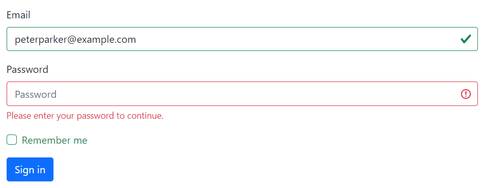
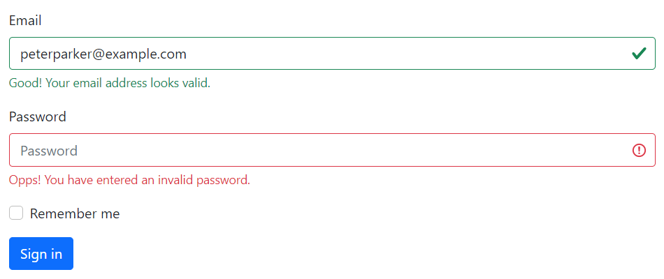
If you require server-side validation, you can alternatively use the .is-invalid and .is-valid classes to indicate invalid and valid form fields. The .invalid-feedback and .valid-feedback are also supported with these classes. Let's take a look at the following example:
Example
Try this code »<form>
<div class="mb-3">
<label class="form-label" for="inputEmail">Email</label>
<input type="email" class="form-control is-valid" id="inputEmail" placeholder="disabled" value="peterparker@example.com" required>
<div class="valid-feedback">Good! Your email address looks valid.</div>
</div>
<div class="mb-3">
<label class="form-label" for="inputPassword">Password</label>
<input type="password" class="form-control is-invalid" id="inputPassword" placeholder="disabled" required>
<div class="invalid-feedback">Opps! You have entered an invalid password.</div>
</div>
<div class="mb-3">
<div class="form-check">
<input class="form-check-input" type="checkbox" id="checkRemember">
<label class="form-check-label" for="checkRemember">Remember me</label>
</div>
</div>
<button type="submit" class="btn btn-primary">Sign in</button>
</form>— The output of the above example will look something like this:
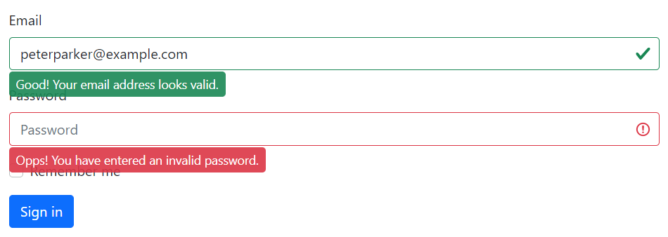
You can alternatively swap the .{valid|invalid}-feedback classes for .{valid|invalid}-tooltip classes to display the validation feedback text in a tooltip style.
Also, be sure to apply the style position: relative or class .position-relative on the parent element for proper feedback tooltip positioning. Here's an example:
Example
Try this code »<form>
<div class="mb-3 position-relative">
<label class="form-label" for="inputEmail">Email</label>
<input type="email" class="form-control is-valid" id="inputEmail" placeholder="disabled" value="peterparker@example.com" required>
<div class="valid-tooltip">Good! Your email address looks valid.</div>
</div>
<div class="mb-3 position-relative">
<label class="form-label" for="inputPassword">Password</label>
<input type="password" class="form-control is-invalid" id="inputPassword" placeholder="disabled" required>
<div class="invalid-tooltip">Opps! You have entered an invalid password.</div>
</div>
<div class="mb-3">
<div class="form-check">
<input class="form-check-input" type="checkbox" id="checkRemember">
<label class="form-check-label" for="checkRemember">Remember me</label>
</div>
</div>
<button type="submit" class="btn btn-primary">Sign in</button>
</form>— The output of the above example will look something like this:
Supported Form Controls in Bootstrap
Bootstrap includes support for all standard HTML form controls as well as new HTML5 input types such as datetime, number, email, url, search, range, color, url, and so on. The following example will show you the usages of standard form controls with Bootstrap.
<form>
    <div class="row mb-3">
        <label class="col-sm-3 col-form-label" for="firstName">First Name:</label>
        <div class="col-sm-9">
            <input type="text" class="form-control" id="firstName" placeholder="disabled" required>
        </div>
    </div>
    <div class="row mb-3">
        <label class="col-sm-3 col-form-label" for="lastName">Last Name:</label>
        <div class="col-sm-9">
            <input type="text" class="form-control" id="lastName" placeholder="disabled" required>
        </div>
    </div>
    <div class="row mb-3">
        <label class="col-sm-3 col-form-label" for="emailAddress">Email Address:</label>
        <div class="col-sm-9">
            <input type="email" class="form-control" id="emailAddress" placeholder="disabled" required>
        </div>
    </div>
    <div class="row mb-3">
        <label class="col-sm-3 col-form-label" for="phoneNumber">Mobile Number:</label>
        <div class="col-sm-9">
            <input type="number" class="form-control" id="phoneNumber" placeholder="disabled" required>
        </div>
    </div>
    <div class="row mb-3">
        <label class="col-sm-3 col-form-label">Date of Birth:</label>
        <div class="col-sm-3">
            <select class="form-select" required>
                <option>Date</option>
            </select>
        </div>
        <div class="col-sm-3">
            <select class="form-select" required>
                <option>Month</option>
            </select>
        </div>
        <div class="col-sm-3">
            <select class="form-select">
                <option>Year</option>
            </select>
        </div>
    </div>
    <div class="row mb-3">
        <label class="col-sm-3 col-form-label" for="postalAddress">Postal Address:</label>
        <div class="col-sm-9">
            <textarea rows="3" class="form-control" id="postalAddress" placeholder="disabled" required></textarea>
        </div>
    </div>
    <div class="row mb-3">
        <label class="col-sm-3 col-form-label" for="ZipCode">Zip Code:</label>
        <div class="col-sm-9">
            <input type="text" class="form-control" id="ZipCode" placeholder="disabled" required>
        </div>
    </div>
    <div class="row mb-3">
        <label class="col-sm-3 col-form-label" for="uploadImage">Upload Image:</label>
        <div class="col-sm-9">
            <input type="file" class="form-control" id="uploadImage">
        </div>
    </div>
    <div class="row mb-3">
        <label class="col-sm-3 col-form-label">Gender:</label>
        <div class="col-sm-9 mt-2">
            <div class="form-check form-check-inline">
                <input type="radio" class="form-check-input" name="gender" id="radioMale">
                <label class="form-check-label" for="radioMale">Male</label>
            </div>
            <div class="form-check form-check-inline">
                <input type="radio" class="form-check-input" name="gender" id="radioFemale">
                <label class="form-check-label" for="radioFemale">Female</label>
            </div>
        </div>
    </div>
    <div class="row mb-3">
        <div class="col-sm-9 offset-sm-3">
            <div class="form-check">
                <input class="form-check-input" type="checkbox" id="checkAgree" value="agree">
                <label class="form-check-label" for="checkAgree">I agree to the <a href="#">Terms and Conditions</a></label>
            </div>
        </div>
    </div>
    <div class="row mb-3">
        <div class="col-sm-9 offset-sm-3">
            <input type="submit" class="btn btn-primary" value="Submit">
            <input type="reset" class="btn btn-secondary ms-2" value="Reset">
        </div>
    </div>
</form>